Flutter中水平布局使用Row,可设置元素水平方向排列,如果想要子元素充满,可把子元素使用Expanded包括起来。
背景
使用Row布局的Widget,不能滑动;通常使用Row布局的时候,默认所有的子元素加起来不能超过父视图的宽度。如果想要横向滑动,可考虑使用ListView。
Ps:当所有子元素的宽度超出了父视图Row的宽度后,会有警告。
如果想要竖向布局,使用Column。
如果只有一个元素,可考虑使用Align或者Center来布局。
基础介绍
- Row常用属性
- children: 子视图
- textDirection: 子视图布局方向
- TextDirection.ltr: 从左到右
- TextDirection.rtl: 从右到左
- mainAxisAlignment: 子视图在父视图上的布局方式,水平方向布局
- MainAxisAlignment.spaceAround: 子视图之间和子视图距离父视图都留有间距
- MainAxisAlignment.center: 所有子试图居中
- MainAxisAlignment.end: 所有子视图居最末尾
- MainAxisAlignment.spaceBetween: 子视图之间留有相等间距,与父视图不留间距
- MainAxisAlignment.spaceEvenly: 子视图之间和子视图距离父视图都留有间距,且间距都相等
- MainAxisAlignment.start,所有子视图居于最开始
注意mainAxisAlignment在子元素使用了Expanded时,没有效果;当所有子元素超出了父视图的宽度时,也没有效果。
子元素不使用Expanded,那么子元素的宽度是根据内容适应,即内容有多少,宽度就有多少。示例如下:
1
2
3
4
5
6
7
8
9
10
11
12
13
14
15
16
17
18
19
20
21
22
23
24
25
26
27
|
class MyApp extends StatelessWidget {
  @override
  Widget build(BuildContext context) {
    return MaterialApp(
      home: Scaffold(
          body: Center(
        child: Row(
          children: [
            Text(
              'First',
              style: TextStyle(backgroundColor: Colors.lightBlueAccent),
              textAlign: TextAlign.center,
            ),
            Text('Second',
                style: TextStyle(backgroundColor: Colors.lightGreenAccent),
                textAlign: TextAlign.center),
            Text('Third',
                style: TextStyle(backgroundColor: Colors.orangeAccent),
                textAlign: TextAlign.center),
          ],
        ),
      )),
    );
  }
}
|
效果如下:
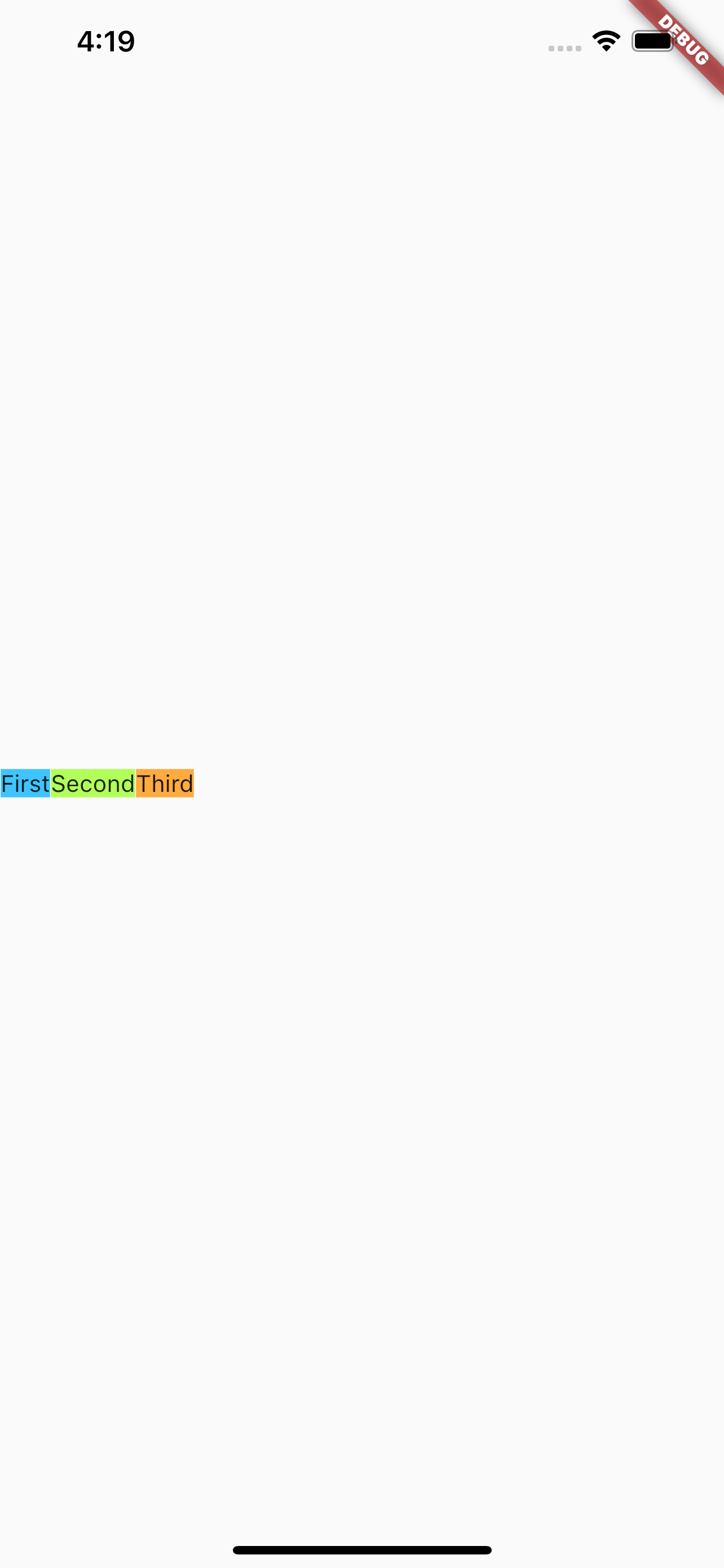
注意,上面的Text中设置了textAlign,但是不论设置什么效果都是一样的。
如果想要上面的first、second、third充满屏幕的宽度,要怎么设置呢?很简单,直接使用Expanded包括起来即可。示例如下:
1
2
3
4
5
6
7
8
9
10
11
12
13
14
15
16
17
18
19
20
21
22
23
24
25
26
27
28
|
class MyApp extends StatelessWidget {
  @override
  Widget build(BuildContext context) {
    return MaterialApp(
      home: Scaffold(
          body: Center(
        child: Row(
          children: [
            Expanded(
                child: Text('First left',
                    style: TextStyle(backgroundColor: Colors.lightBlueAccent),
                    textAlign: TextAlign.left)),
            Expanded(
                child: Text('Second center',
                    style: TextStyle(backgroundColor: Colors.lightGreenAccent),
                    textAlign: TextAlign.center)),
            Expanded(
                child: Text('Third right',
                    style: TextStyle(backgroundColor: Colors.orangeAccent),
                    textAlign: TextAlign.right)),
          ],
        ),
      )),
    );
  }
}
|
效果如下:
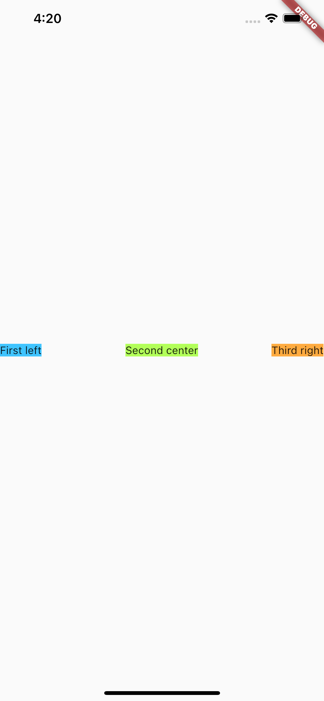
同样,上面的Text设置了textAlign,设置不同的textAlign,会发现不同的显示效果,对比后能发现,同时使用Expanded包括起来后,相当于三个子元素均分了屏幕宽度。
实战
来看一个效果,左侧一个小Icon,中间是一段很长的文案,右边再有一个小Icon。
现在来对比一下,下面几种情况的显示效果:
- 所有子元素都没有
Expanded的情况
- 所有子元素都使用
Expanded的情况
- 中间很长的文案使用
Expanded,其它子元素不用的情况
所有子元素都没有Expanded的情况
代码如下:
1
2
3
4
5
6
7
8
9
10
11
12
13
14
15
16
17
18
|
class MyApp extends StatelessWidget {
  @override
  Widget build(BuildContext context) {
    return MaterialApp(
        home: Scaffold(
      body: Center(
        child: Row(children: [
          const FlutterLogo(),
          const Text(
              "Flutter's hot reload helps you quickly and easily experiment, build UIs, add features, and fix bug faster. Experience sub-second reload times, without losing state, on emulators, simulators, and hardware for iOS and Android."),
          const Icon(Icons.sentiment_satisfied),
        ]),
      ),
    ));
  }
}
|
效果如下:
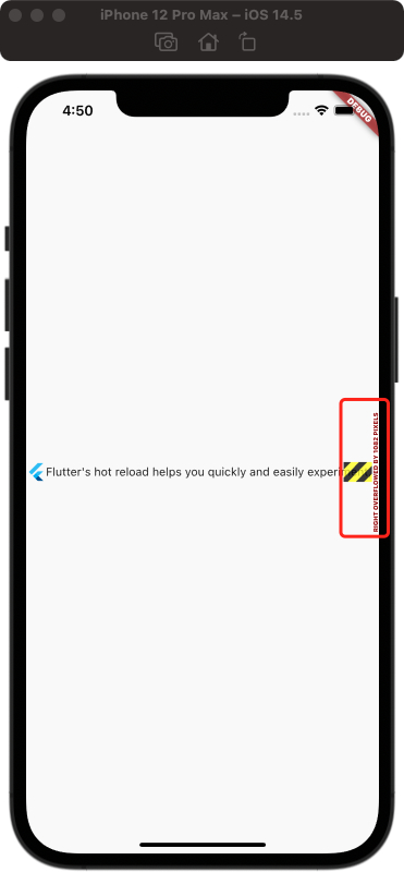
可以看到左侧Icon显示出来了,且是原始大小;中间的文案显示了,但是未完成;右侧的Icon看不到。
还记得最开始说的当子元素的宽度超出时,Flutter会显示提示,图片中最右侧红框标出来的部分,就是Flutter的提示。
所有子元素都使用Expanded的情况
代码如下:
1
2
3
4
5
6
7
8
9
10
11
12
13
14
15
16
17
18
19
|
class MyApp extends StatelessWidget {
  @override
  Widget build(BuildContext context) {
    return MaterialApp(
        home: Scaffold(
      body: Center(
        child: Row(children: [
          Expanded(child: FlutterLogo()),
          Expanded(
              child: const Text(
                  "Flutter's hot reload helps you quickly and easily experiment, build UIs, add features, and fix bug faster. Experience sub-second reload times, without losing state, on emulators, simulators, and hardware for iOS and Android.")),
          Expanded(child: const Icon(Icons.sentiment_satisfied)),
        ]),
      ),
    ));
  }
}
|
效果如下:
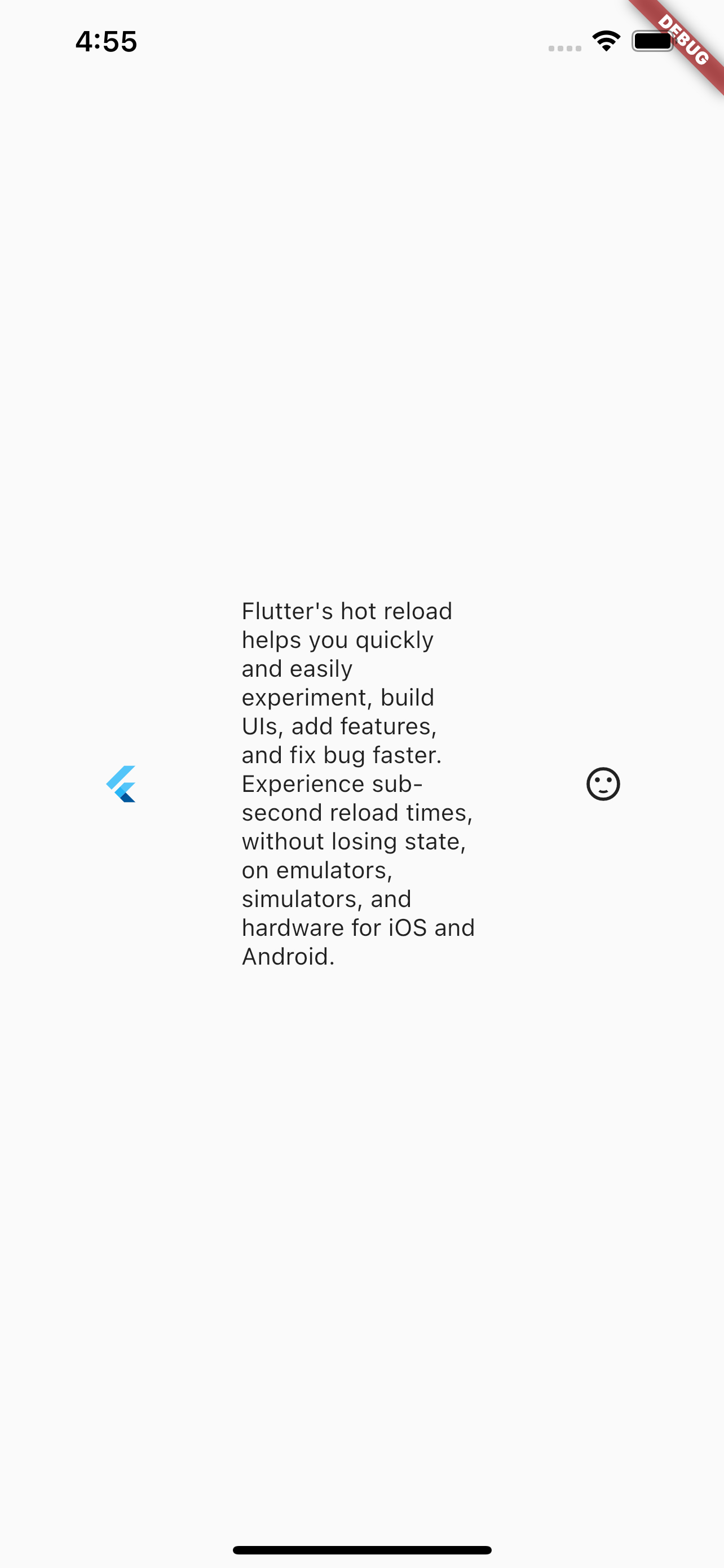
可以看到,所有子元素都显示出来了,且所有子元素均分了父元素的宽度,从中间文案的显示可以看出来。验证了之前所说的,当所有子元素都使用Expaned包括时,会平均分配宽度。
中间很长的文案使用Expanded,其它子元素不用的情况
代码如下:
1
2
3
4
5
6
7
8
9
10
11
12
13
14
15
16
17
18
19
|
class MyApp extends StatelessWidget {
  @override
  Widget build(BuildContext context) {
    return MaterialApp(
        home: Scaffold(
      body: Center(
        child: Row(children: [
          const FlutterLogo(),
          Expanded(
              child: const Text(
                  "Flutter's hot reload helps you quickly and easily experiment, build UIs, add features, and fix bug faster. Experience sub-second reload times, without losing state, on emulators, simulators, and hardware for iOS and Android.")),
          const Icon(Icons.sentiment_satisfied),
        ]),
      ),
    ));
  }
}
|
效果如下:
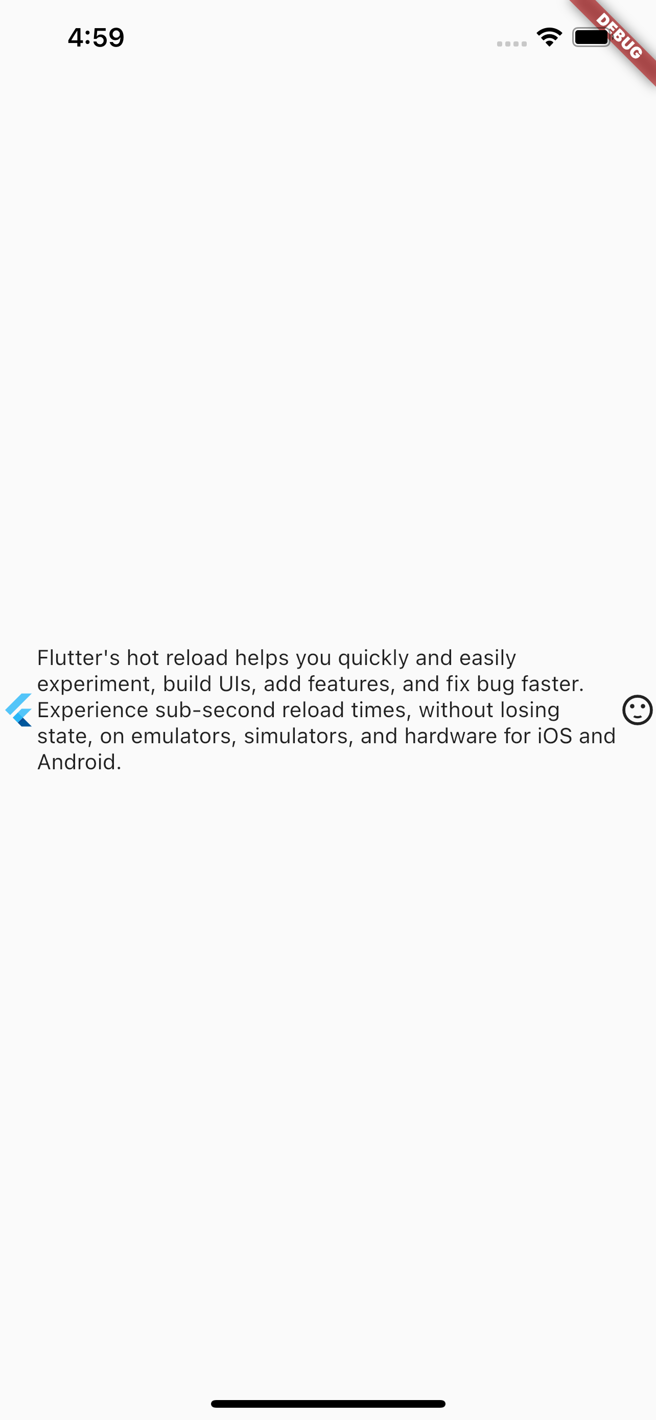
可以看出,所有子元素都显示出来了,且,左侧Icon和右侧Icon的大小是按照本身的大小显示,然后余下的部分用于显示了文本,且没有超出。
参考
Row Dev Doc
Flutter免费视频第三季-布局