Flutter组件基础——Button
Flutter组件基础——Button
Flutter中常用的Button有ElevatedButton、TextButton、OutlinedButton,之前可能还有RaisedButton、FlatButton、OutlineButton,但是已被废弃,参考RaisedButton vs ElevatedButton, FlatButton vs TextButton and OutlineButton vs OutlinedButton
TextButton
TextButton可简单理解为按钮,即可点击的Text。
常用属性如下:
- TextButton常用属性:
- autofocus
- child
- clipBehavior
- enabled
- focusNode
- onLongPress
- onPressed
- style
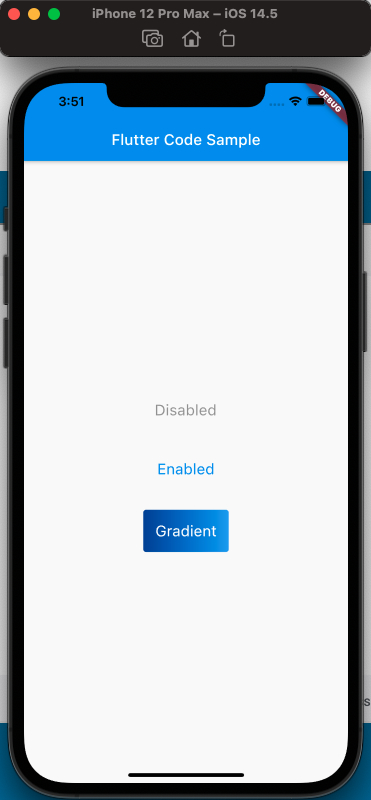
来看一下,定义三个按钮,分别对应,按钮不可点击,按钮可点击,按钮带有渐变背景,三种情况,效果如下:
使用代码如下:
1 |
|
注意渐变按钮的实现,使用了Stack。
ElevatedButton
- ElevatedButton的属性:
- autofocus
- child
- clipBehavior
- enabled
- focusNode
- key
- onLongPress
- onPressed
- style
代码如下:
1 |
|
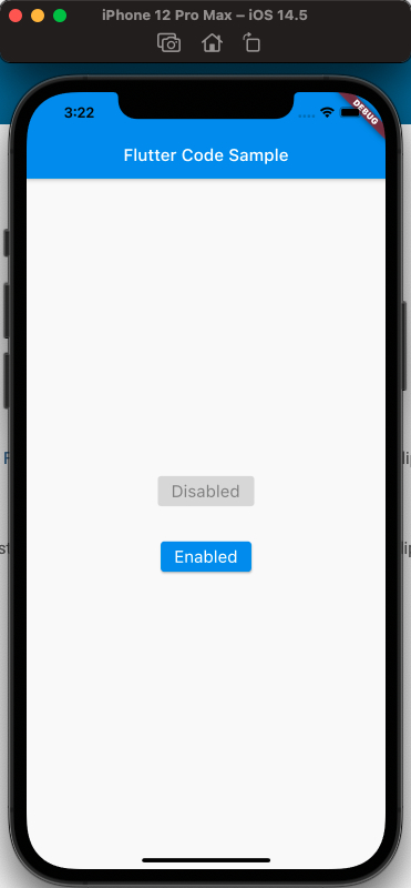
效果如下:
OutlinedButton
- OutlinedButton的属性如下:
- autofocus
- child
- clipBehavior
- enabled
- focusNode
- key
- onLongPress
- onPressed
- style
代码如下:
1 |
|
样式如下:
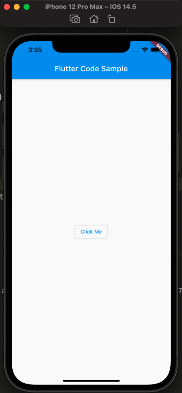
Ps: 可以试一下点击效果!
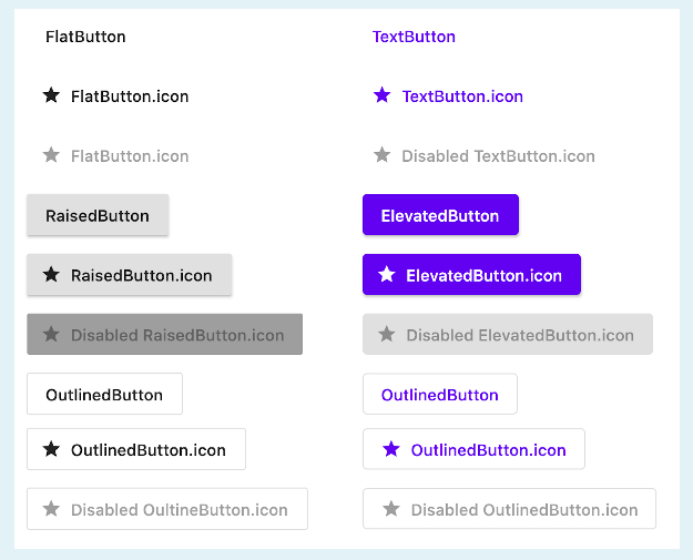
各个Button样式的对比:
参考
Text Button Api Doc
ElevatedButton Api Doc
OutlinedButton Api Doc
RaisedButton vs ElevatedButton, FlatButton vs TextButton and OutlineButton vs OutlinedButton
本博客所有文章除特别声明外,均采用 CC BY-NC-SA 4.0 许可协议。转载请注明来源 今是昨非的博客!