1
2
3
4
5
6
7
8
9
10
11
12
13
14
15
16
17
18
19
20
21
22
23
24
25
26
27
28
29
30
31
32
33
34
35
36
37
38
39
40
41
42
43
44
45
46
47
48
49
50
51
52
53
54
55
56
57
58
59
60
61
62
63
64
65
66
67
68
69
70
71
72
73
74
75
76
77
78
79
80
81
82
83
84
85
86
87
88
89
90
91
92
93
94
95
96
97
98
99
100
101
102
103
104
105
106
107
108
109
110
111
112
113
114
115
116
117
118
119
120
121
122
123
124
125
126
127
128
129
130
131
132
133
134
135
136
137
138
139
140
141
142
143
144
145
146
147
148
149
150
151
|
void main() {
runApp(const BottomAppBarDemo());
}
class BottomAppBarDemo extends StatefulWidget {
const BottomAppBarDemo({Key? key}) : super(key: key);
@override
State createState() => _BottomAppBarDemoState();
}
class _BottomAppBarDemoState extends State<BottomAppBarDemo> {
bool _showFab = true;
bool _showNotch = true;
FloatingActionButtonLocation _fabLocation =
FloatingActionButtonLocation.endDocked;
void _onShowNotchChanged(bool value) {
setState(() {
_showNotch = value;
});
}
void _onShowFabChanged(bool value) {
setState(() {
_showFab = value;
});
}
void _onFabLocationChanged(FloatingActionButtonLocation? value) {
setState(() {
_fabLocation = value ?? FloatingActionButtonLocation.endDocked;
});
}
@override
Widget build(BuildContext context) {
return MaterialApp(
home: Scaffold(
appBar: AppBar(
automaticallyImplyLeading: false,
title: const Text('Bottom App Bar Demo'),
),
body: ListView(
padding: const EdgeInsets.only(bottom: 88),
children: <Widget>[
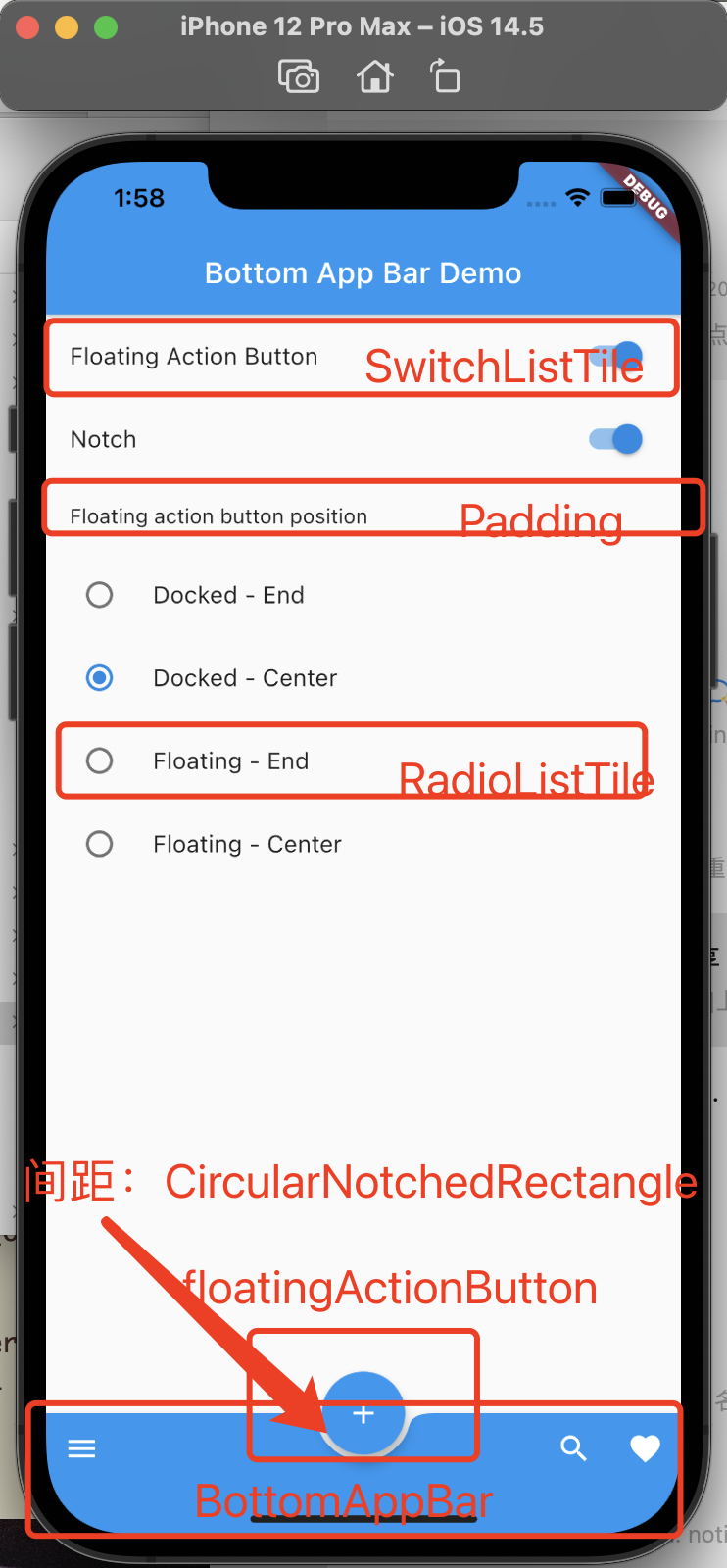
SwitchListTile(
value: _showFab,
onChanged: _onShowFabChanged,
title: const Text('Floating Action Button'),
),
SwitchListTile(
value: _showNotch,
onChanged: _onShowNotchChanged,
title: const Text('Notch'),
),
const Padding(
padding: EdgeInsets.all(16),
child: Text('Floating action button position'),
),
RadioListTile(
value: FloatingActionButtonLocation.endDocked,
groupValue: _fabLocation,
onChanged: _onFabLocationChanged,
title: const Text('Docked - End'),
),
RadioListTile(
value: FloatingActionButtonLocation.centerDocked,
groupValue: _fabLocation,
onChanged: _onFabLocationChanged,
title: const Text('Docked - Center'),
),
RadioListTile(
value: FloatingActionButtonLocation.endFloat,
groupValue: _fabLocation,
onChanged: _onFabLocationChanged,
title: const Text('Floating - End'),
),
RadioListTile(
value: FloatingActionButtonLocation.centerFloat,
groupValue: _fabLocation,
onChanged: _onFabLocationChanged,
title: const Text('Floating - Center'),
),
],
),
floatingActionButton: _showFab
? FloatingActionButton(
onPressed: () {},
child: const Icon(Icons.add),
tooltip: 'Create',
)
: null,
floatingActionButtonLocation: _fabLocation,
bottomNavigationBar: _DemoBottomAppBar(
fabLocation: _fabLocation,
shape: _showNotch ? const CircularNotchedRectangle() : null),
),
);
}
}
class _DemoBottomAppBar extends StatelessWidget {
const _DemoBottomAppBar({
this.fabLocation = FloatingActionButtonLocation.endDocked,
this.shape = const CircularNotchedRectangle(),
});
final FloatingActionButtonLocation fabLocation;
final NotchedShape? shape;
static final List<FloatingActionButtonLocation> centerLocations =
<FloatingActionButtonLocation>[
FloatingActionButtonLocation.centerDocked,
FloatingActionButtonLocation.centerFloat,
];
@override
Widget build(BuildContext context) {
return BottomAppBar(
shape: shape,
color: Colors.blue,
child: IconTheme(
data: IconThemeData(color: Theme.of(context).colorScheme.onPrimary),
child: Row(
children: <Widget>[
IconButton(
tooltip: 'Open navigation menu',
icon: const Icon(Icons.menu),
onPressed: () {},
),
if (centerLocations.contains(fabLocation)) const Spacer(),
IconButton(
tooltip: 'Search',
icon: const Icon(Icons.search),
onPressed: () {},
),
IconButton(
tooltip: 'Favorite',
icon: const Icon(Icons.favorite),
onPressed: () {},
),
],
),
),
);
}
}
|